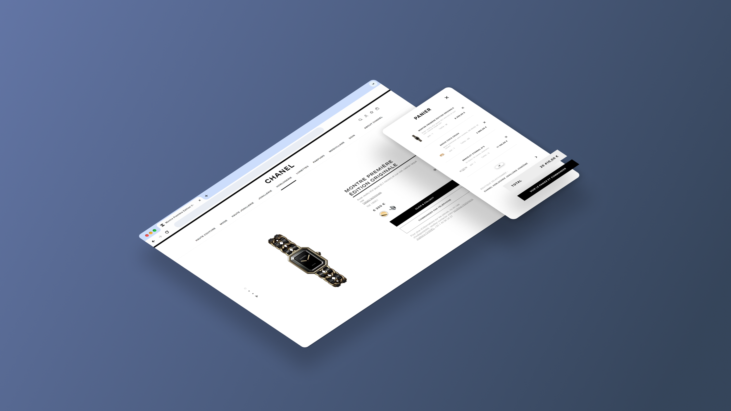
CHANEL
Brand experience & ecommerce platform for Chanel - UX/UI Case study
About project
OVERVIEW
My tasks
This fictional project, designed for Chanel, focus on refining the UX/UI of the Chanel.com "cart" module.
Currently, users experience friction in managing items within the cart and encounter unclear pathways that can hinder a seamless checkout.
This redesign targets pain points, aiming to create a more intuitive, frictionless experience that aligns with the brand’s luxurious identity. By improving visual hierarchy, streamlining item management, and optimizing interactive feedback, the updated journey aspires to elevate both usability and brand elegance in every step of the purchase process.
My role
System
USER CENTERED DESIGN
Working on this project involved navigating through various stages of user-centered design, each focused on refining different aspects of the shopping experience. From initial research and wireframing to mockups and final designs, every decision was guided by a commitment to creating an optimal user experience. This process allowed me to continuously evaluate and enhance how each feature contributes to a seamless, intuitive journey for the user, ensuring that the final design aligns with their needs and expectations.
Research
BRAINSTORMING
Via brainstorming session on the UX/UI redesign of the Chanel.com cart page, we explored a range of improvements to create a more intuitive and visually accessible shopping experience. The goal was to refine the cart journey to align with users' browsing habits, optimize the display of essential information, and integrate additional functionalities that enhance the overall flow. Here is a recap of the key ideas that emerged:
Hypothesis
Users prefer immediate visibility of essential elements like CTAs, cart total, and store selection, as it reduces cognitive load and makes the checkout process faster.
Users are likely to find a left-to-right layout more intuitive, with products on the left and checkout details on the right, aligning with natural reading and browsing patterns.
Users want quick access to their saved items; integrating a Wishlist module will help them easily retrieve and add desired products to their cart without leaving the page.
Users expect flexibility in selecting or modifying their store for Click & Collect within the cart panel, as this enhances control over their shopping experience.
User Research
PERSONAS
UX Research
USER FLOW
After developing the personas, I analyzed the current user flow of the cart on Chanel.com, using these personas as a guide to better understand potential user needs and behaviors. This approach allowed me to pinpoint areas where the flow aligns with or falls short of user expectations, helping to identify improvements that would enhance the overall shopping experience for our target clients.
UX Design
WIREFRAMING
Visual Design
USER INTERFACE
For the mock-ups, I aimed to stay true to the refined, elegant style of the Chanel website, ensuring a cohesive and brand-consistent look. I also introduced a subtle personal touch, enhancing certain elements to improve usability and better reflect the user flow enhancements, while respecting Chanel's luxury aesthetic.
Key enhancement
Design System
UI STYLE GUIDE
Button
Hover effect on products


